

Your clinic website is often the first interaction a patient has with your practice. Before they ever call, book, or send an enquiry, they look at your website to answer one question: Can I trust this clinic with my health? A website that converts is not just attractive it communicates trust, clarity, and expertise within seconds. In today’s competitive healthcare landscape, having a beautiful website isn’t enough. You need one that guides visitors smoothly towards booking an appointment.
In this guide, we’ll walk you through what truly makes a clinic website convert visitors into patients. You’ll learn about design, copywriting, user experience, trust signals, and the essential features that doctors often overlook. Whether you’re building a new website or improving your existing one, this guide gives you a practical blueprint for creating a site that works around the clock to grow your clinic.
Start With the Real Purpose of Your Website
Many clinics treat their website as an online brochure a place to list services, opening hours, and contact details. While that information matters, it’s not the real job of your website. Your website exists to turn interest into action.
Every page should guide visitors toward one outcome: booking an appointment or making an enquiry. That means your content, layout, imagery, and navigation must work together to reassure patients, answer their concerns, and show them exactly what to do next.
A website converts well when it:
- Clearly explains who you help and how
Patients should instantly understand whether your clinic is right for them. Clear service descriptions, ideal patient cues, and simple language reduce confusion and prevent drop-offs. - Builds trust within the first few seconds
Design, imagery, and tone all influence first impressions. Professional visuals, real clinic photos, credentials, and patient testimonials help visitors feel confident quickly. - Addresses patient concerns before they’re voiced
Most patients arrive with questions about safety, results, pricing, or recovery. Anticipating and answering these concerns upfront removes hesitation and builds reassurance. - Makes booking simple, visible, and friction-free
Calls to action should be obvious and easy to use across all devices. Fewer form fields, clear buttons, and multiple booking options increase the chances of conversion.
When every page on your website has a clear goal, it stops functioning like a static brochure and starts working as a growth tool for your clinic. By building trust, answering patient concerns, and making the next step obvious, your website guides visitors from curiosity to confidence and from confidence to booking.
Your Homepage Has 5 Seconds to Win the Patient Here’s How

When someone lands on your homepage, you have roughly five seconds to convince them they’re in the right place. If they feel confused, overwhelmed, or unsure, they’ll leave often without scrolling or clicking anything at all. First impressions matter more in healthcare than almost any other industry.
A strong homepage doesn’t need to be flashy or overdesigned. It needs clarity, reassurance, and direction. Visitors should instantly understand who you are, what you do, why they can trust you, and exactly what step to take next.
The Core Elements Every Clinic Homepage Needs
- A headline focused on the patient’s outcome
Forget clinical jargon or internal terminology. Your headline should speak directly to what patients care about most clearer vision, healthier skin, pain relief, or a confident smile. If a visitor can read it and immediately think, “Yes, that’s exactly what I’m looking for,” you’ve done your job. - A subheading that removes all confusion
This is your clarity line. In one simple sentence, explain who you help, what service you provide, and what makes your clinic different or better. A strong subheading prevents uncertainty and reassures visitors they’re in the right place. - A bold, above-the-fold call to action
“Book Now”, “Enquire Today”, or “Check Availability” the exact wording matters less than visibility and placement. Your primary call to action should appear immediately and feel natural, not pushy. As users scroll, it should reappear at logical moments to guide action. - Real reviews from real patients
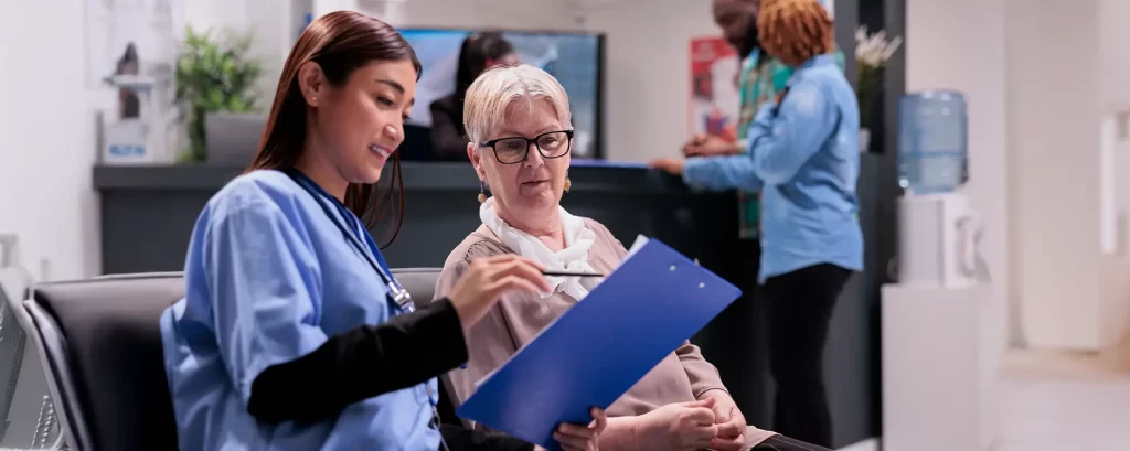
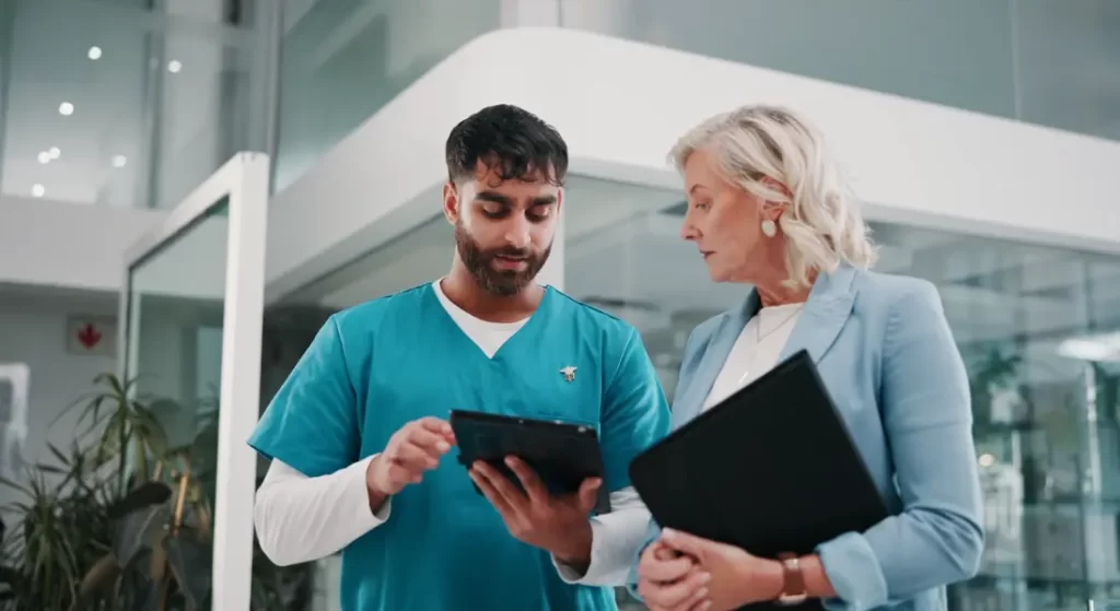
Trust is everything in healthcare. Genuine patient feedback reduces anxiety and builds confidence fast. Google ratings, short testimonials, or review snippets placed strategically on the homepage can significantly influence booking decisions. - Authentic images of your clinic and team
Real photos create familiarity and comfort. Showing your actual clinic space and team members helps patients feel at ease before they ever walk through the door. Authentic visuals always outperform generic stock images when it comes to trust.
Your homepage is often the most visited page on your website and the first step in a patient’s decision-making process. When it’s built with clarity and intent, it stops being just an introduction and starts working as a powerful conversion engine for your clinic.
Build Treatment Pages That Answer Every Patient Question
One of the biggest missed opportunities on clinic websites is weak treatment pages. When information is short or vague, it doesn’t give you the confidence to enquire. A strong treatment page should feel like a calm consultation, clearly explaining the treatment without sounding like a sales pitch.
Each page should start by explaining the treatment in simple, patient-friendly language. You shouldn’t need prior knowledge to understand it. From there, it should clearly explain who the treatment is suitable for and what results you can realistically expect.
Walking you through how the procedure works, step by step, helps remove uncertainty. Clear details about recovery time, aftercare, and any limitations or risks build trust and help you plan with confidence.
Finally, it should be easy for you to take the next step. Before-and-after images and patient stories can reduce hesitation, while visible booking or enquiry buttons throughout the page let you act the moment you feel ready.
Make Navigation Effortless (Especially on Mobile)

If patients can’t find what they need quickly, they won’t stick around. Navigation should feel simple and intuitive, helping you move around the site without confusion. Clear, patient-friendly labels make it easy to know exactly where to go.
Keep menus short and avoid cramming everything into the top bar. Too many options can overwhelm you and make it harder to find what matters most. Streamlined menus guide you naturally to the information you need.
Mobile usability is critical since most patients search for clinics on their phones. Your mobile menu should load instantly, scroll smoothly, and feel effortless to use.
Large, tappable buttons make navigation easy even on smaller screens. When moving around the site is simple, you’re far more likely to explore treatments and take the next step.
Use Trust Signals Everywhere Not Just Once
Healthcare decisions can feel emotional and vulnerable, so building trust is essential. Trust signals help reduce anxiety and make booking an appointment feel safe and straightforward.
These signals include doctor or dentist profiles with credentials, awards and accreditations, press mentions, professional associations, Google reviews, and before-and-after galleries. Clear safety and hygiene standards are equally important to show patients they’re in capable hands.
The key is not to limit these signals to a single page. Display them throughout your website so reassurance is constant, helping you feel confident at every step.
By naturally integrating trust cues across the site, patients are more likely to explore treatments, trust the clinic, and take action without hesitation.
Write Copy That Feels Human, Not Clinical
Patients don’t want to wade through complicated medical jargon they want clear, reassuring information. Writing in a human, approachable way helps them feel understood from the very first sentence.
Use simple words, short paragraphs, and a conversational tone that speaks directly to “you” and “your”. This makes the content feel personal and easy to follow.
Address common fears and concerns openly rather than avoiding them. Acknowledging what worries patients shows empathy and honesty.
When your copy feels warm, clear, and supportive, patients are far more likely to trust your clinic and feel confident taking the next step.
Create a Booking Journey That Feels Effortless

A smooth, frictionless booking process is crucial for converting visitors into patients. If scheduling feels complicated, even interested visitors may abandon your site. Your goal is to make booking as simple, fast, and reassuring as possible.
Offer multiple options to cater to different preferences:
- Clickable phone number for immediate calls
Some patients prefer talking to a real person. Make your phone number prominent and tap-to-call on mobile so they can reach you instantly without hunting through the site. - Simple online booking or enquiry form accessible 24/7
An online form lets patients book or send enquiries at any time, even outside clinic hours. Keep it short, clear, and easy to complete to reduce hesitation. - WhatsApp or chat for quick questions and confirmations
Many patients feel more comfortable sending a quick message before committing. Offering chat or WhatsApp support can answer last-minute questions and reassure them in real time. - Optimised forms for clarity and ease
Ask only essential questions to avoid overwhelming patients. Ensure mobile-first design, clear instructions, and immediate confirmation messages with next steps. This builds confidence and prevents confusion.
When booking feels effortless, you remove barriers that stop patients from converting. Every small improvement in your booking journey directly increases the chances that a visitor becomes a confirmed appointment.
Use Real Images and Video to Build Confidence
Visuals play a huge role in establishing trust and comfort. Real photos of your clinic, team, and treatment rooms help patients visualise their experience and feel at ease before they even walk through the door. Authentic imagery conveys professionalism and transparency far more effectively than generic stock photos.
Video content takes this a step further. Short treatment explainers, patient testimonials, or behind-the-scenes clips humanise your brand and show the real people behind your services. Videos can answer common questions, demonstrate your expertise, and provide reassurance that patients are in safe, capable hands.
By combining real images and video, your website creates a welcoming, trustworthy first impression that helps visitors feel confident about choosing your clinic.
Make Location and Local SEO Impossible to Miss
Most patients choose clinics based on convenience, so your location should never be hidden or hard to find. Display it prominently on every page, include a map, clear directions, parking details, and nearby landmarks. This helps patients plan their visit and reduces any hesitation about travelling to your clinic.
Local SEO ensures your clinic shows up when patients search for services nearby. Creating dedicated treatment pages with location-specific content signals to search engines and reassures visitors that you operate in their area. This combination of visibility and clarity increases both online enquiries and footfall.
By making your location and local presence obvious, you make it easier for patients to choose you and for search engines to show you first.
Build Content That Answers Real Patient Questions
A clinic blog should do more than just improve SEO it should educate, reassure, and guide patients through every stage of their journey. Thoughtful content positions your clinic as a trusted authority while helping visitors feel informed and confident about their choices.
High-performing content often includes:
- Treatment comparisons – Help patients weigh options and understand which service is right for them. Include pros, cons, and differences in results so visitors can make an informed decision without confusion.
- Pricing explanations – Clear, transparent information reduces anxiety and avoids surprises. Adding examples, packages, or common scenarios helps patients plan ahead and feel confident about the value they’ll receive.
- “What to expect” guides – Step-by-step overviews of procedures ease nerves and set realistic expectations. Detailing the process, recovery time, and potential sensations helps build trust before the patient even arrives.
- Condition breakdowns – Explain common issues in simple language so patients feel understood. Including causes, symptoms, and treatment options reassures patients that you truly understand their concerns.
- Before-and-after journeys – Show real results and experiences to build trust. Highlighting authentic patient stories, timelines, and visible outcomes makes your services tangible and credible.
- Aftercare advice – Demonstrate ongoing support and commitment to patient wellbeing. Offering practical tips, follow-up steps, and signs to watch for helps patients feel safe and cared for after treatment.
When content genuinely addresses patient concerns, it encourages repeat visits, builds trust, and naturally drives bookings. Educating visitors doesn’t just inform it converts.
Speed Matters More Than Most Clinics Realise
A slow website can quickly frustrate patients and create doubt about your clinic’s professionalism. People naturally associate fast, smooth websites with organised, reliable, and trustworthy practices. When pages take too long to load, patients may leave before they even see what you offer, which can directly affect your enquiries and bookings.
Speed matters more than most clinics realise because it shapes the very first impression. Even small delays can make visitors question your efficiency, and in healthcare, confidence matters. Patients want to feel reassured from the moment they land on your site, and a slow website undermines that trust.
You can significantly improve load times by compressing images without losing quality, using high-performance hosting, minimising unnecessary plugins, and keeping your website code clean and streamlined. Regular maintenance also ensures your site continues to run smoothly as content and traffic grow.
Track Behaviour to Keep Improving Conversions
Monitoring how visitors interact with your website is essential to optimise conversions. Understanding what works and what doesn’t allows you to make informed changes that guide more visitors toward booking.
Key metrics to track:
- Clicks on booking buttons – See which CTAs are performing best and which pages drive the most bookings. This helps you replicate success across the site.
- Drop-off pages – Identify where visitors leave your site to uncover obstacles or confusing content. Fixing these pages reduces bounce rates and keeps potential patients engaged.
- Most visited treatment pages – Knowing which services attract the most attention allows you to optimise content, CTAs, and cross-links to improve conversions.
- Scroll depth – Track how far users scroll to ensure important content and CTAs are being seen. If critical information is missed, consider redesigning layout or placement.
- Time on page – Gauge engagement by seeing which pages hold attention. Longer time usually indicates useful, relevant content; short visits may signal a need for improvement.
- Mobile performance – With most searches happening on mobile, ensure pages load quickly, forms work flawlessly, and navigation is intuitive on all devices.
- Traffic sources – Understand where your visitors come from Google search, social media, email campaigns so you can focus marketing efforts on channels that deliver the best results.
Use tools like Google Analytics, Hotjar, and your booking system data to make informed adjustments. Continuous monitoring and optimisation create a patient journey that feels seamless, reassuring, and conversion-friendly.
Common Website Mistakes Clinics Still Make
Your clinic website is often the first point of contact between you and potential patients. In today’s competitive healthcare environment, it’s no longer enough to simply list services, opening hours, and contact details. Visitors expect clarity, trustworthiness, and a seamless path to booking an appointment from the moment they arrive.
A high-performing website doesn’t just look good it converts interest into action. Every page should guide visitors toward a clear outcome, whether that’s making an enquiry, booking a consultation, or learning more about a treatment. By focusing on patient needs, trust-building, and effortless navigation, your website becomes a powerful tool for growing your practice.
- Using overly technical language – Medical jargon can confuse visitors and make your clinic seem unapproachable. Clear, patient-friendly language helps them understand services and feel confident.
- Hiding booking buttons – If CTAs aren’t obvious, patients may leave without taking action. Prominent, repeated booking buttons guide visitors toward conversion effortlessly.
- Relying on stock images – Generic visuals fail to build trust. Real photos of your clinic, team, and treatments create authenticity and make patients feel comfortable.
- Publishing thin treatment pages – Pages with minimal information leave questions unanswered. Detailed content, FAQs, and patient guides build confidence and improve SEO.
- Ignoring reviews and trust signals – Testimonials, Google ratings, and certifications reassure patients that your clinic is reputable. Without them, visitors may hesitate to book.
- Being vague about pricing – Unclear or hidden costs create anxiety. Transparent pricing or package information reduces hesitation and increases the likelihood of booking.
Fixing these common mistakes often leads to immediate improvements in website performance, patient trust, and overall conversions.
What a High-Converting Clinic Website Really Feels Like
A high-converting clinic website is more than just attractive it creates an experience where everything works together seamlessly. When your site does this well, patients immediately feel clear about what you offer and confident in your expertise.
They feel comfortable taking the next step and booking an appointment, knowing they are in capable hands. Every page, every element, reassures them and reduces any hesitation.
From navigation to treatment information, trust signals to human, approachable copy, each part of the website should work to guide patients naturally and confidently.
This combination of clarity, trust, and ease is what true conversion looks like in healthcare when patients feel informed, reassured, and ready to act.
FAQs:
- Why does my clinic website need to focus on conversions instead of just information
A clinic website must prioritise conversions because patients rarely book appointments based on information alone. While educational content is important, visitors come with specific concerns and want reassurance that your clinic is trustworthy, experienced and capable of helping them. A conversion-focused website guides them emotionally and logically toward taking action through clear messaging, trust signals, relatable explanations and an easy booking journey. - What makes a homepage convert visitors into patients?
A high-converting homepage instantly tells visitors who you are, what problems you solve and why they can trust you. Patients typically decide within seconds whether a clinic feels credible, so your homepage must clearly present your value, your expertise and your main call to action. Real photos, patient reviews and a simple layout help reduce hesitation. When the homepage feels reassuring, warm and easy to navigate, visitors are far more likely to stay, explore your treatments and take the next step. - Why are real photos better than stock images on a clinic website?
Real photos create emotional trust by showing the actual people, spaces and experiences patients will encounter. Stock images often feel generic and can give the impression of a clinic trying to hide something, which weakens credibility. Visitors want to see your dentists, doctors, nurses and clinic environment because it helps them picture themselves receiving care in a safe, modern setting. - What should every treatment page include to increase enquiries?
A strong treatment page provides a clear explanation of the procedure, who it’s suitable for, what results patients can expect and what the process involves from start to finish. It also sets realistic expectations by mentioning limitations or risks without creating fear. When patients understand how the treatment works and see real before-and-after results, they feel more prepared and confident. - Why is mobile optimisation so important for clinic websites?
Most patients browse on their phones, often while travelling, working or researching symptoms quickly. If a website loads slowly, looks cluttered or is hard to navigate on mobile, users become frustrated and leave. A mobile-optimised site presents information clearly, loads fast and makes booking simple, even on small screens. When patients can tap, read and enquire effortlessly, your clinic appears more professional and accessible, leading to significantly higher conversions. - How do trust signals influence patient decisions online?
Trust signals help patients feel safe choosing your clinic without needing to visit in person. When you showcase credentials, real reviews, awards, before-and-after results and clear information about safety standards, visitors see proof of your expertise. This reassurance is essential because healthcare decisions involve risk, emotion and vulnerability. Strong trust signals replace uncertainty with confidence and make booking feel like a logical next step rather than a gamble. - Why is website speed so critical for patient engagement?
A slow website creates frustration, raises doubts about professionalism and dramatically increases the chances that visitors will leave before learning about your treatments. Patients associate fast, smooth websites with organised and modern clinics, while slow pages suggest outdated systems or poor attention to detail. Improving speed enhances the overall user experience and keeps patients engaged long enough to understand what you offer and make a booking decision. - What role does copywriting play in improving conversions?
Copywriting shapes how patients perceive your clinic and whether they feel understood. When your content uses simple, human language, it makes visitors feel comfortable, reassured and valued. Overly technical or clinical language can alienate readers and make your website feel cold or complicated. Clear, empathetic writing that addresses fears, explains benefits and guides decisions helps transform interest into action by building emotional and intellectual trust. - Why should my website offer multiple booking options?
Patients have different preferences when it comes to taking action, so offering just one booking method limits conversions. Some prefer calling to ask quick questions, others like filling out a form quietly, and many appreciate the convenience of WhatsApp or chat. Providing all three options removes barriers and allows patients to choose the method that feels easiest and most comfortable. When booking becomes frictionless, the likelihood of securing appointments increases dramatically. - How does tracking user behaviour improve my website’s performance?
Tracking behaviour helps you understand exactly how patients interact with your website so you can make strategic improvements. When you know where visitors drop off, which treatments attract the most interest and what buttons receive the most clicks, you gain insight into what needs refinement. Analysing these patterns allows you to adjust layout, messaging, images or CTAs based on real user activity rather than guesswork.
Final Thought: Turning Your Website Into a Patient-Winning Asset
Building a clinic website that genuinely converts isn’t about adding more pages or complicated features it’s about clarity, trust, and a seamless patient journey. When your site speaks directly to patient needs, shows real proof of your expertise, and makes booking effortless, it becomes one of the most powerful growth assets in your practice.
By focusing on strong messaging, authentic visuals, structured treatment pages, fast performance, and simple navigation, your website stops being a digital brochure and starts working as a 24/7 conversion engine. These elements help patients feel informed, reassured, and confident enough to take the next step.
At Clinic Engine, our medical marketing company works closely with clinics to build websites and marketing systems that attract more patients, strengthen brand authority, and improve long-term visibility. We help you refine your messaging, implement trust-driven design, and optimise every touchpoint that influences conversions.
If you’re ready to transform your clinic website into a high-performing patient acquisition tool, get in touch with us for a friendly consultation and we’ll show you exactly how to make your digital presence work harder for your practice.